Core
Basic Dialogs
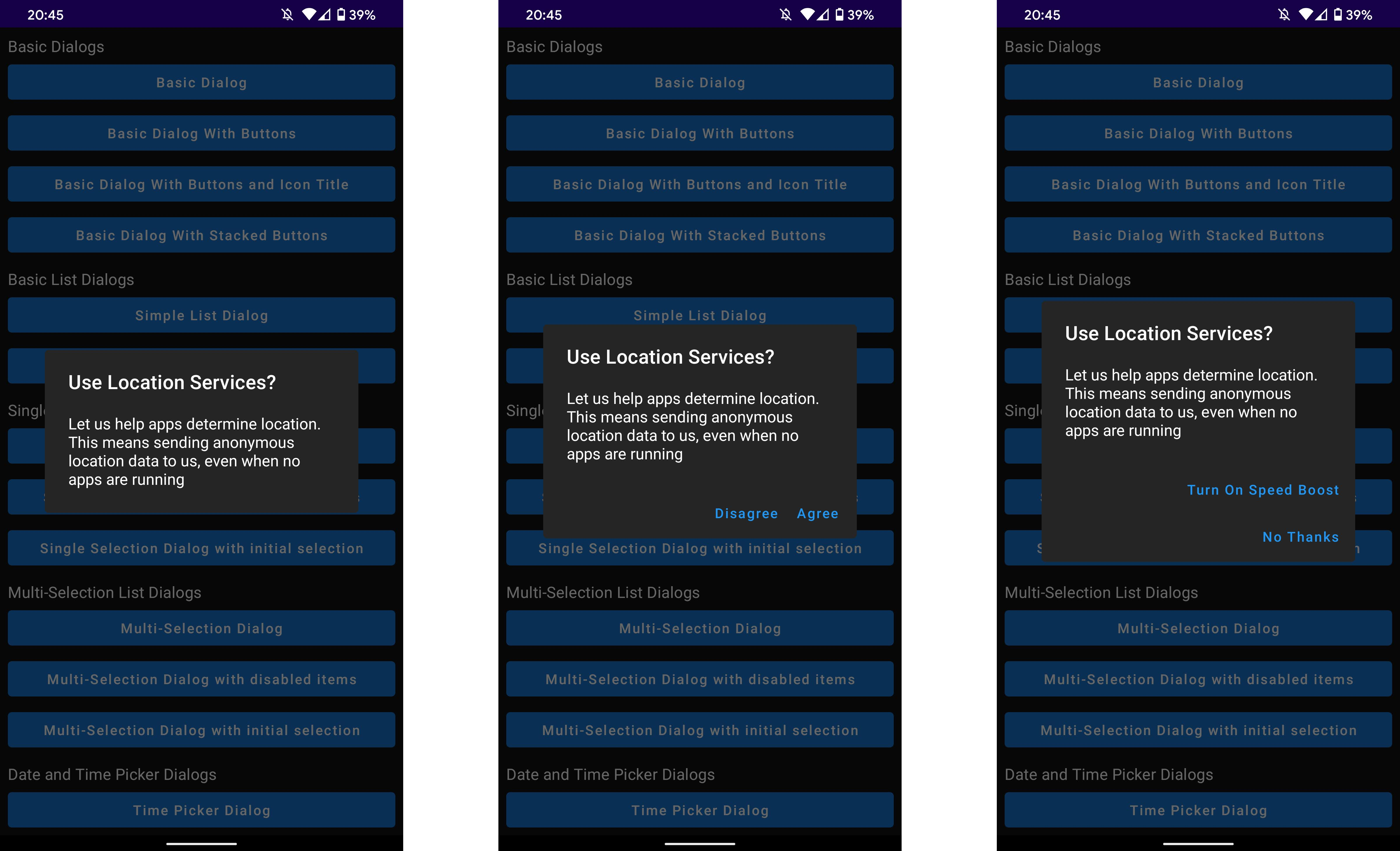
Here is an example to make a basic dialog with a title and text:
val dialogState = rememberMaterialDialogState()
MaterialDialog(dialogState = dialogState) {
    title(text = "Use Location Services?")
    message(res = R.string.location_dialog_message)
}

/* This should be called in an onClick or an Effect */
dialog.show()
The dialog is shown when the dialog.show() is called. The hard coded strings for all the components in the example above can be replaced with a string resource id.
Buttons can be added to the dialog by adding the buttons parameter:
MaterialDialog(
    dialogState = dialogState,
    buttons = {
        positiveButton("Ok")
        negativeButton("Cancel")
    }
) {
    ...
}
If the text of the buttons is too long to fit in one row the buttons will be automatically stacked on top on one another.
Input Dialogs
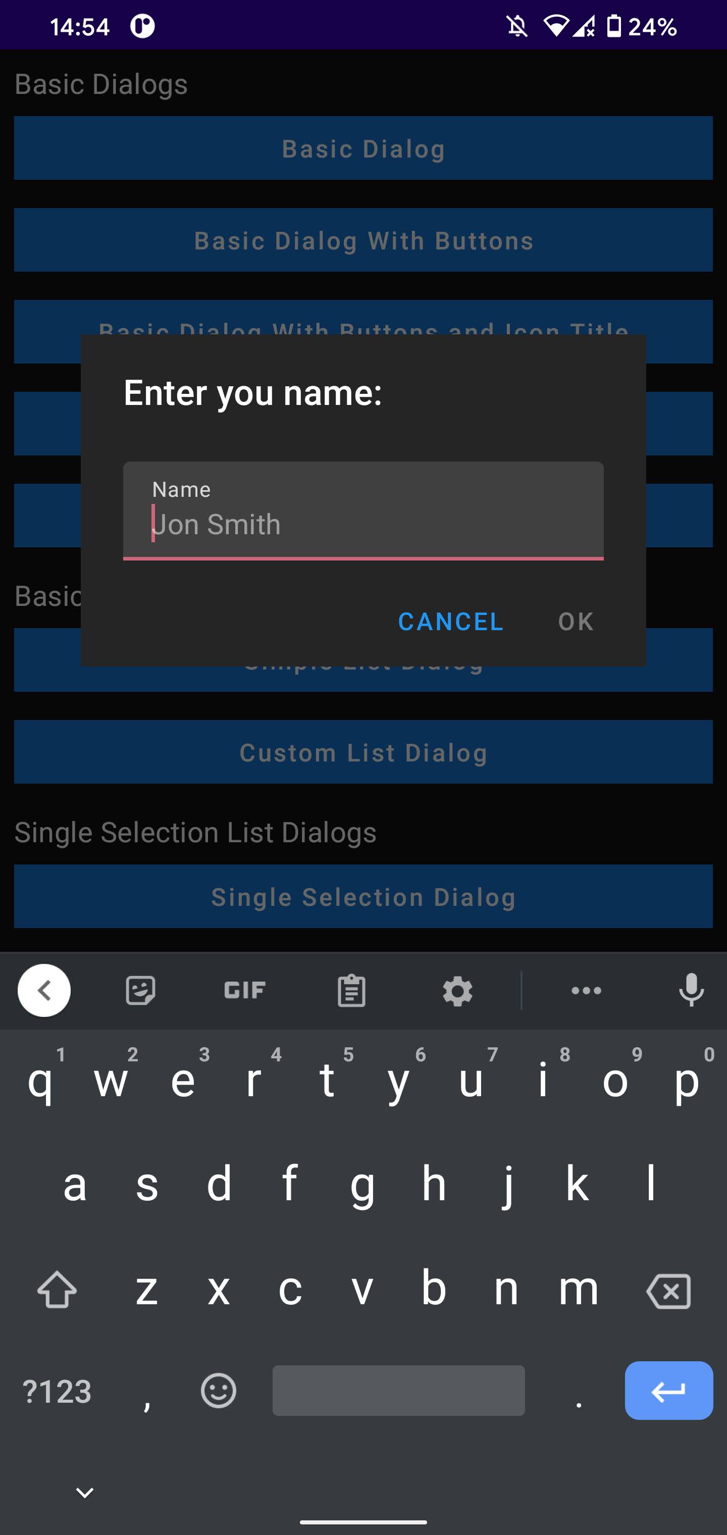
MaterialDialog(dialogState = dialogState, buttons = { ... }) {
    ...
    input(label = "Name", hint = "Jon Smith") { inputString ->
        /* Do something */
    }
    ...
}
In the code snippet above creates the dialog seen in the image (without the title). Once an input is entered and the user presses the positive button, the dialog will callback with the string the user inputted. The input function also has other parameters which can be found in the comment above the input function implementation.
List Dialogs
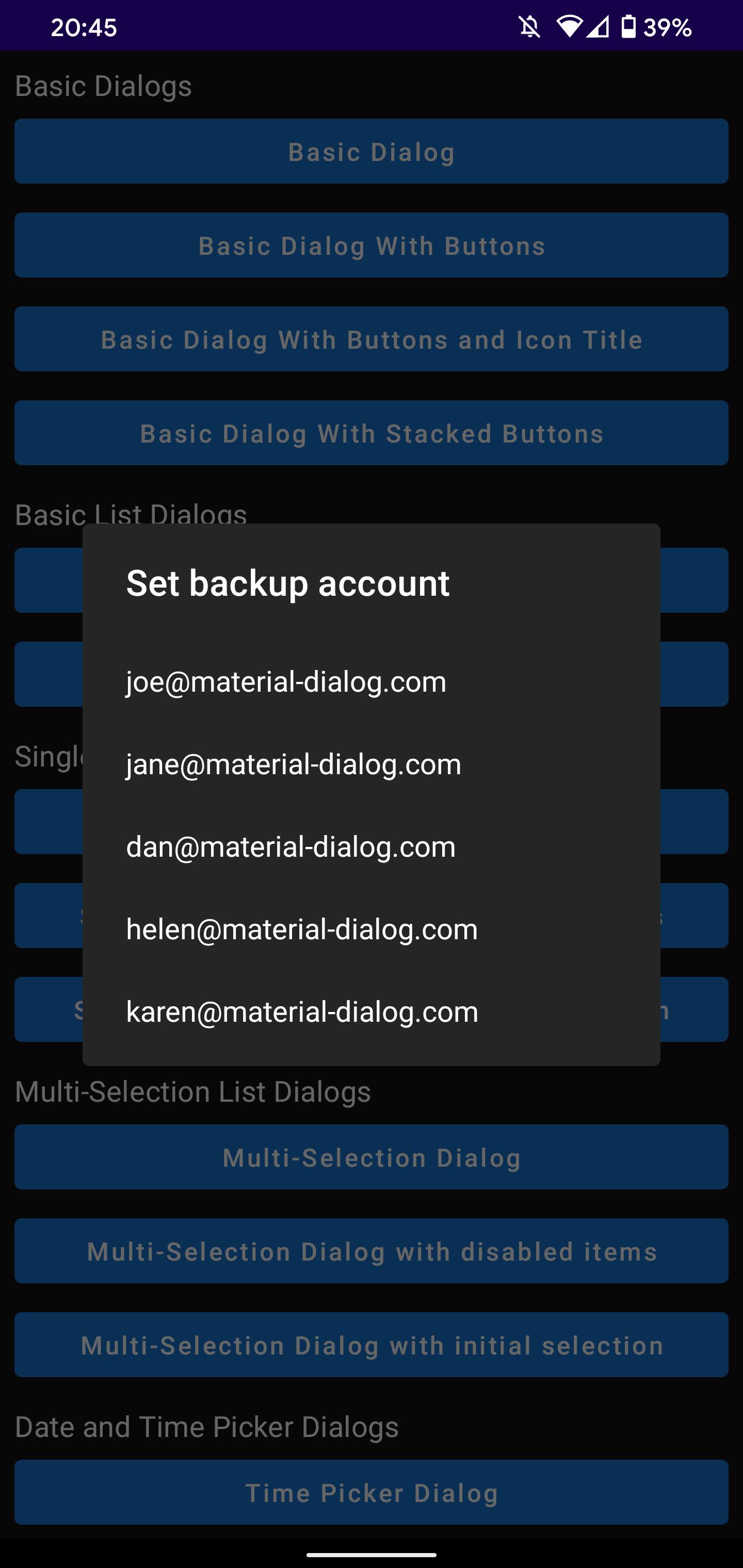
Below is an example of a plain list dialog:
MaterialDialog(dialogState = dialogState) {
    ...
    listItems(listOf("Item 1", "Item 2", "Item 3"), onClick { index, item ->
        //Do Something
    })
    ...
}
If you would like to use a custom list item layout you can use the following code:
data class TextIcon(text: String, icon: ImageAsset)
val items = listOf(
    TextIcon("Item 1", imageFromResource(R.drawable.item_one))
    TextIcon("Item 2", imageFromResource(R.drawable.item_two))
    TextIcon("Item 3", imageFromResource(R.drawable.item_three))
)

...

MaterialDialog(dialogState = dialogState) {
    ...
    listItems(items, onClick { index, item ->
        //Do Something
    }) {
        Row {
            Box(Modifier.preferedSize(40.dp)) {
                Image(it.icon)
            }
            Text(it.text, modifier = Modifier.padding(start = 12.dp))
        }
    }
    ...
}
Single Choice List
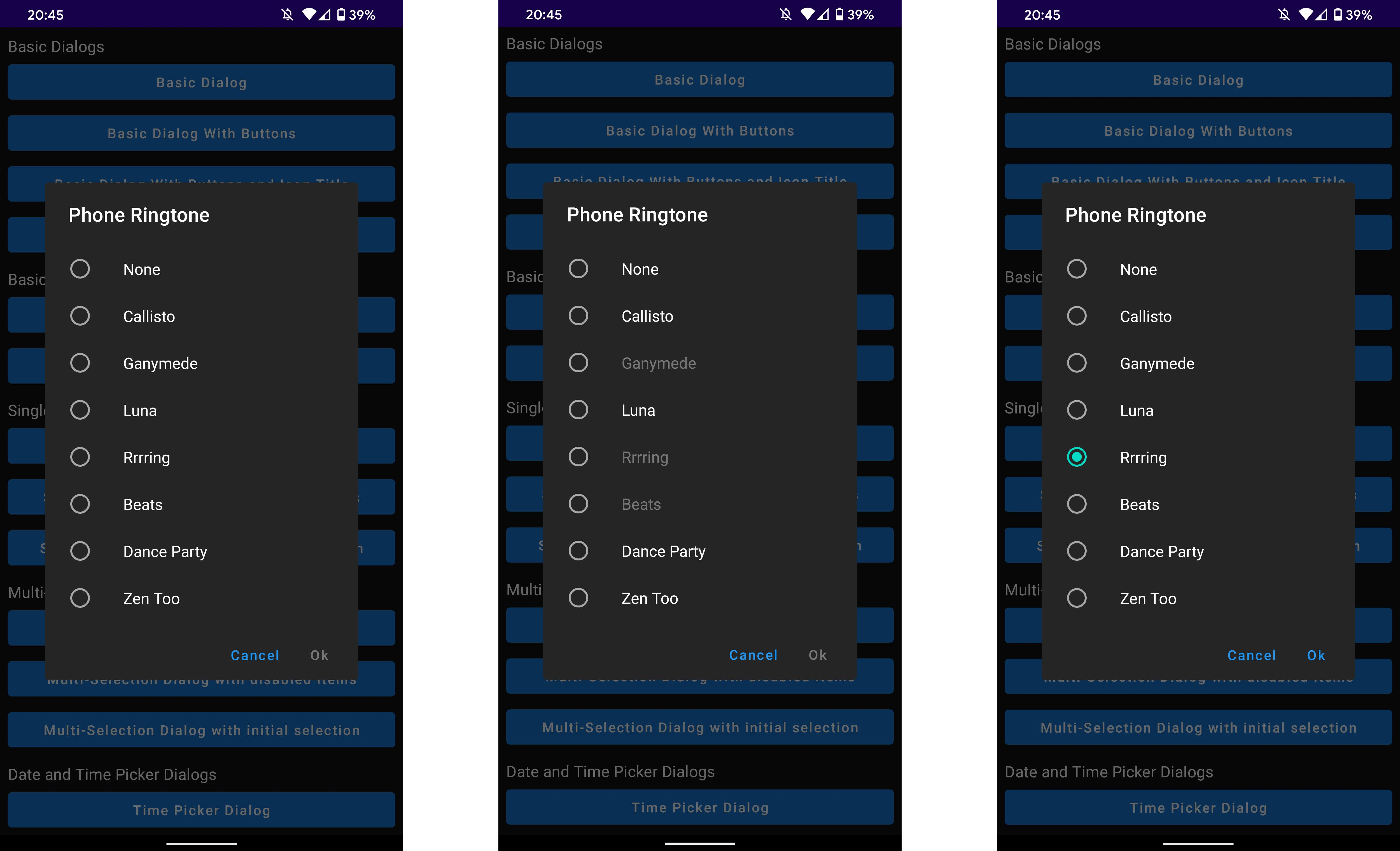
MaterialDialog(dialogState = dialogState, buttons = { ... }) {
    listItemsSingleChoice(
        list = listOf("Item 1", "Item 2", "Item 3"),
        disabledIndices = listOf(1),
        initialSelection = 2
    ) {
        //Do Something
    }
}
As seen in the code snippet above you can pass in a list of indices of items which should be disabled (ie. cannot be selected) and the item index which should selected to start with. By default, if no initial selection is given it will default to the first item.
Multiple Choice List
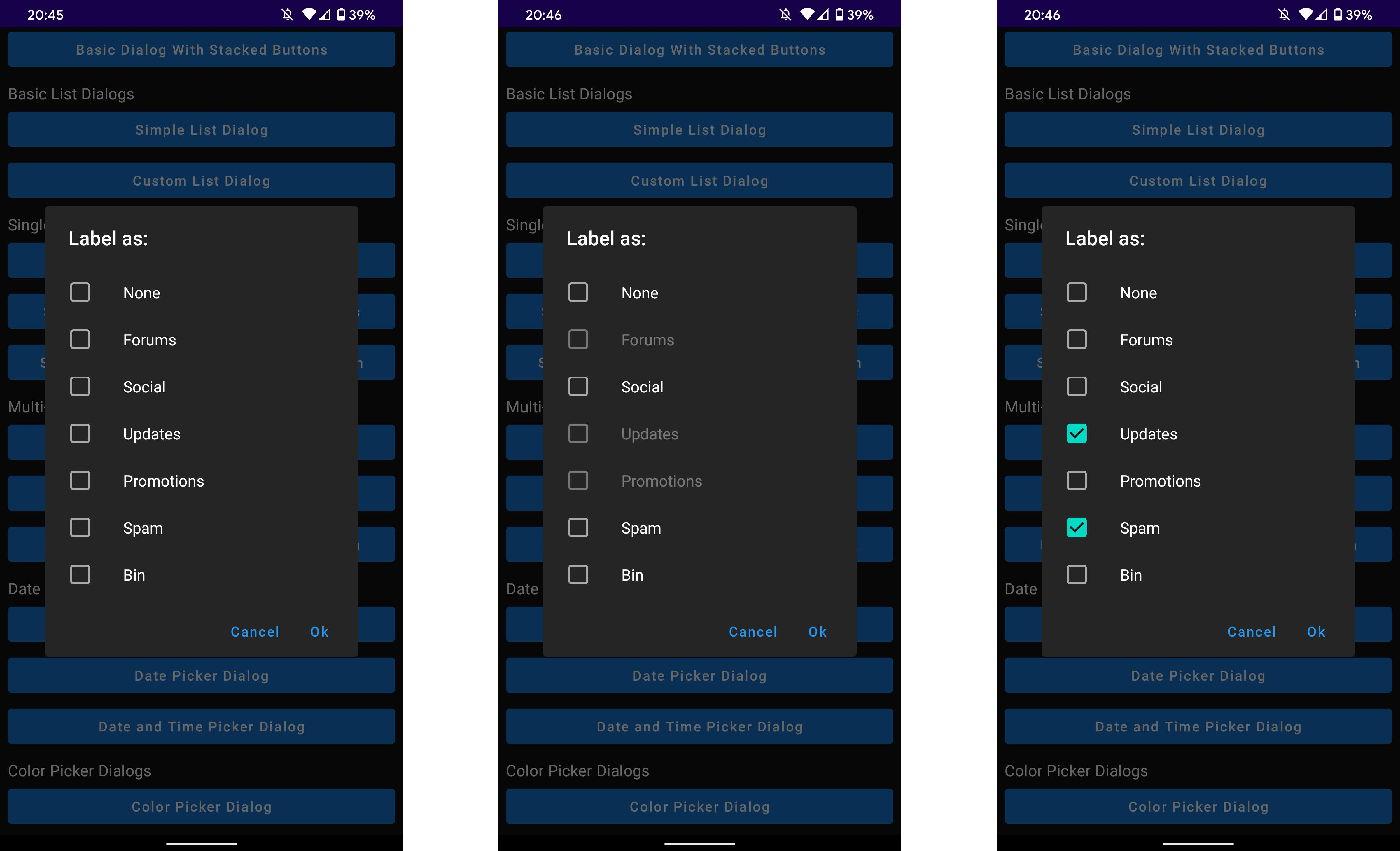
MaterialDialog(dialogState = dialogState, buttons = { ... }) {
    listItemsSingleChoice(
        list = listOf("Item 1", "Item 2", "Item 3"),
        disabledIndices = listOf(1),
        initialSelection = listOf(1)
    ) {
        //Do Something
    }
}
As seen in the code snippet above you can select which items will be disabled (ie. cannot be selected) and also a list of item indicies which should be initially selected.
Custom View
MaterialDialog(dialogState = dialogState, buttons = { ... }) {
    customView {
        //Define your view here
    }
}
The custom view provides a box with the appropriate material design padding's assigned to it so that your content. If you don't want the padding you can just put your composable anywhere in the dialog.build scope and it will be displayed as normal.
Theming
The background colour of the dialog can be changed by using the backgroundColor parameter of the build function:
MaterialDialog(dialogState = dialogState, buttons = { ... }, backgroundColor = Color.Red) {
    title(text = "Use Location Services?")
    message(res = R.string.location_dialog_message)
}
The shape of the dialog is defaulted to the MaterialTheme.shapes.medium property but can also be set using the shape parameter in MaterialDialog .